WAARAYA: TELL YOUR STORY IN LIFE OR AFTER

Client: Waaraya
Role: UX/UI designer
Duration: 2 week sprint
UX methodologies used: user interviews, affinity mapping, user personas & scenarios, problem statement & how might we, brainstorming, MoSCoW prioritization, prototyping, usability testing.
Starting point
Waaraya means immortal in Somali and its goal is to become the platform that helps you save your memories for future generations.
The client had a vague idea of what it could be and barely provided any research or a business plan to start from. The early-stage was a website with a logo and imagery that evoked different ideas and a lot of misleading information:

Understanding the topic
The first contact with the users was a small survey Waaraya had sent out. We learned:
• Target audience: women aged 35-50.
• For 54,1% it’s hard to trust someone to deliver a posthumous message.
• People really worry about being absent in the future important moments of their loved ones.
• Almost everyone struggles to remember to save memories.
What’s out there?

We researched numerous afterlife platforms as well as life journals and pregnancy diaries. We discovered:
• Storytelling
No website feature allows you to tell your story. They mostly are places where you can upload and save your content but with no guidance or templates. (The same way a social media platform or hard drive does)
• Emotional legacy
It is a letter or a video with attachments but it allows no storytelling.
• File storage
Files aren’t organized, tagged, or have any hierarchy visualization. They can’t be seen in infographics like a timeline or a family tree.
• Serious and deadly
They talk about the afterlife in a very somber way. We believe Waaraya can become a celebration of life instead of just a posthumous memory collection.
Websites researched: Hasta Siempre, Envita, Safebeyond, Tellmebye, Everplans, Testamenta, Testamento Emocional, Pregnancy Diary 2020, 280: Pregnancy Diary, Dosedays, Famileo, Cake.
What we learned
To further understand the problem we continued the research with another survey and 20 personal interviews.
• Memories deeply shape people’s identity. They give them a deep sense of self and help them learn about their roots.
• People suffer from losing irrecoverable memories while moving, when hard drives break down, etc.
• People have issues finding the time to organize and store memories. There isn’t an effective way to do it.
• Many interviewees don’t want to leave messages for when they’re gone. They would rather tell their loved ones how they feel while they’re alive.
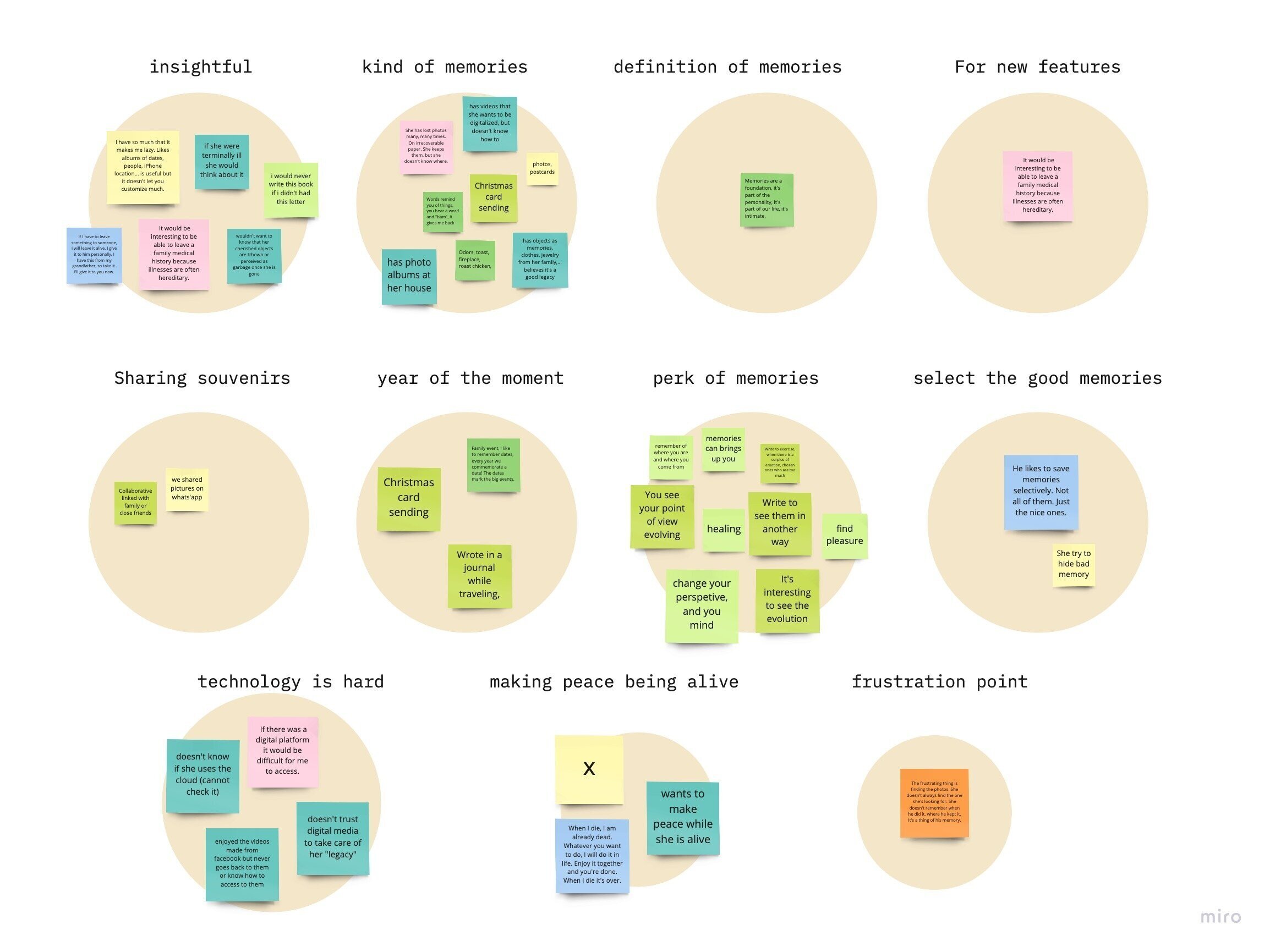
Affinity diagram
The challenge
• People that value memories...
have issues sharing their story because there’s no easy and trustworthy way to do so.
• Let’s help them
developing a platform that is safe and effortless, so they can tell their story.

Our user, Carmen
Demographics
40 years old. Has an insurance company. Married for 12 years, pregnant.
Behaviours
Saves lots of memories digitally and has family heirlooms.
Attitudes
Revisiting memories brings her joy and helps her know herself better.
Needs/challenges
Securely saving her memories, finding time to organize them.
Goals/motivations
Learning about her past
How can we help?
Helping her storing her files with reminders, tags and a timeline.
Empowering her to tell her story through guided questions.
Identity, palette & typography
Our branding was inspired from a core belief that came up a lot in our interviews: we are made of memories. The dot pattern creating an icon symbolizes how multiple parts can make a whole person. In terms of typography we used Archia by Atipo foundry, a modern sans serif font with very wide eyes. It feels open and clean as well as user friendly.

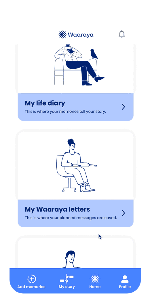
Working on the main flow: the life diary
We focused our work on one flow: uploading an element and providing the necessary context about it. This is the first step to provide the life diary with personal content.

Prototype
Splash screen: the dots form our logo made of memories.
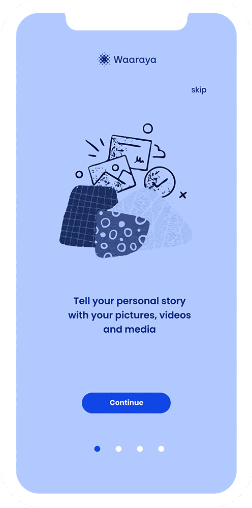
Small onboarding describing the product’s features and name categories.
Information screens on each category.


Design decisions and iterations
Testing showed the different products inside the platform were complicated to understand, so we created an onboarding. However, we realized we were trying to give the user too much information from the get go and we later improved it to make it more visual and quick to read.

Differentiate marketing terms from UX writing terms. Calling the messages to be sent after you’re gone “emotional legacy” was confusing to the users. We named them Waaraya letters, so it was a middle ground between the brand and what the feature does.
We also improved the file upload flow so instead of having it be a whole other section we integrated it on top of the existing flow. User testing showed that having a file upload similar to what for instance what’s app uses, was more discoverable and simpler to use.

Next steps
Developing the app on desktop.
More in depth guided questions.
Data visualization. Implementing a visual timeline feature.
Waaraya letters designs for the receiver. (both email template and a physical box).
Feature prioritization:
++++ Must have
File uploads (photo, audio and video)
Guided writing
Easy descriptions
Reminders
+++ Should have
Send a message to somebody
Guided questions
++ Could have
Geolocalization
Timeline showcase
Collaborative albums
+ Would like to have
Social media file upload integration
Google drive integration
OCR document scanning
- Won’t have
“Add a friend” or social media features